Featured Website
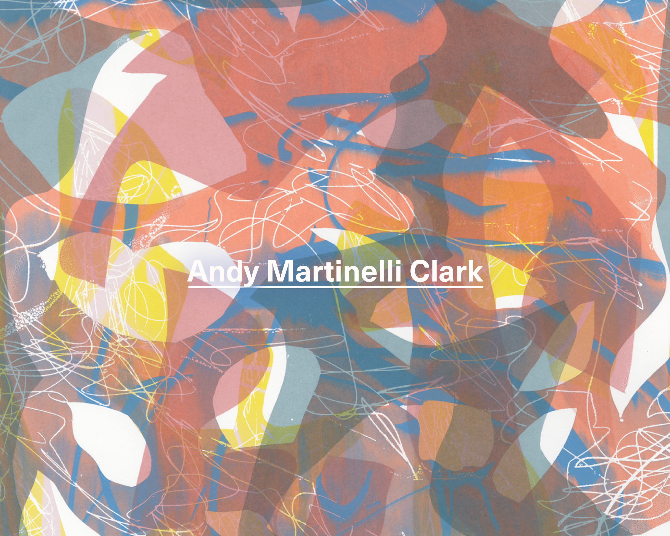
Andy Martinelli Clark
The context in which artwork lives is almost equally as important as the work itself. How will the world see it? What is the point of expression if it is never seen? In 2020, when in-person experience has been retracted, books and well-considered digital viewing rooms have risen to the challenge of paving a new path for how we share information.
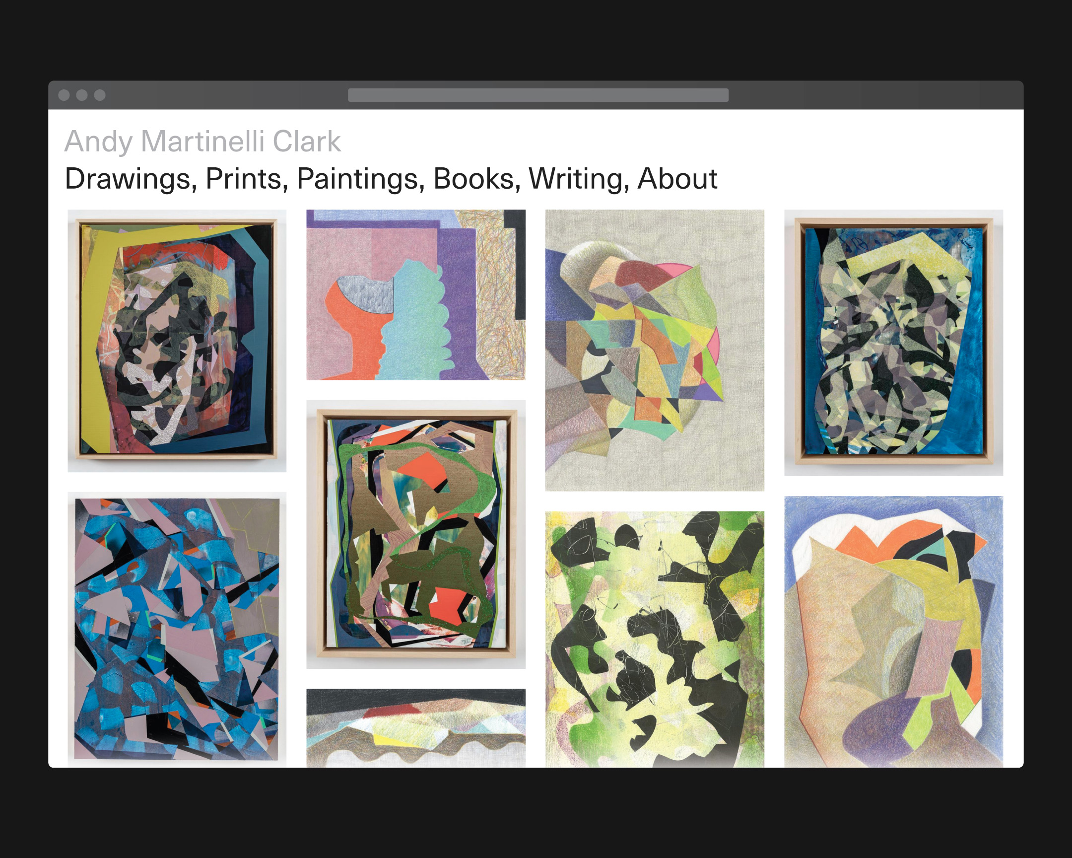
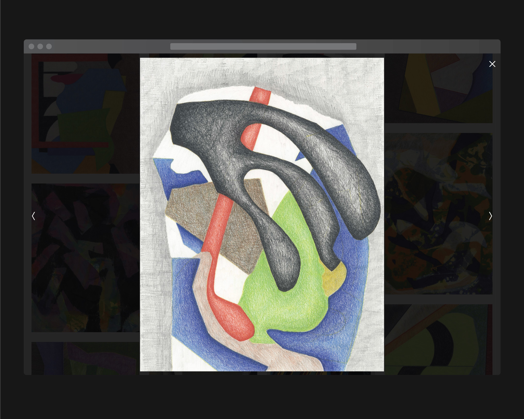
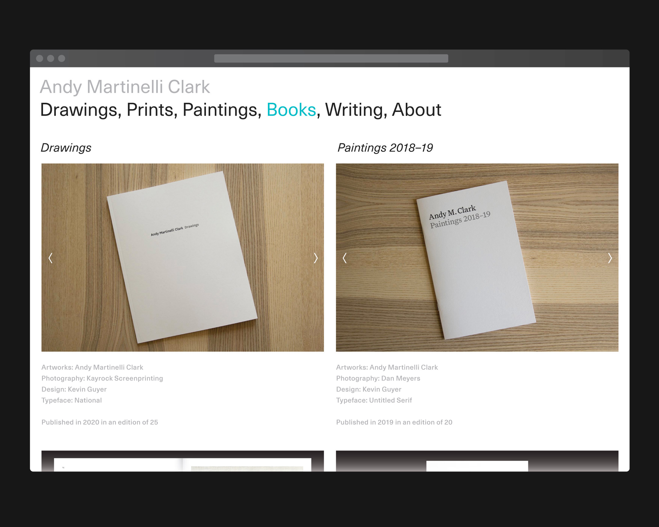
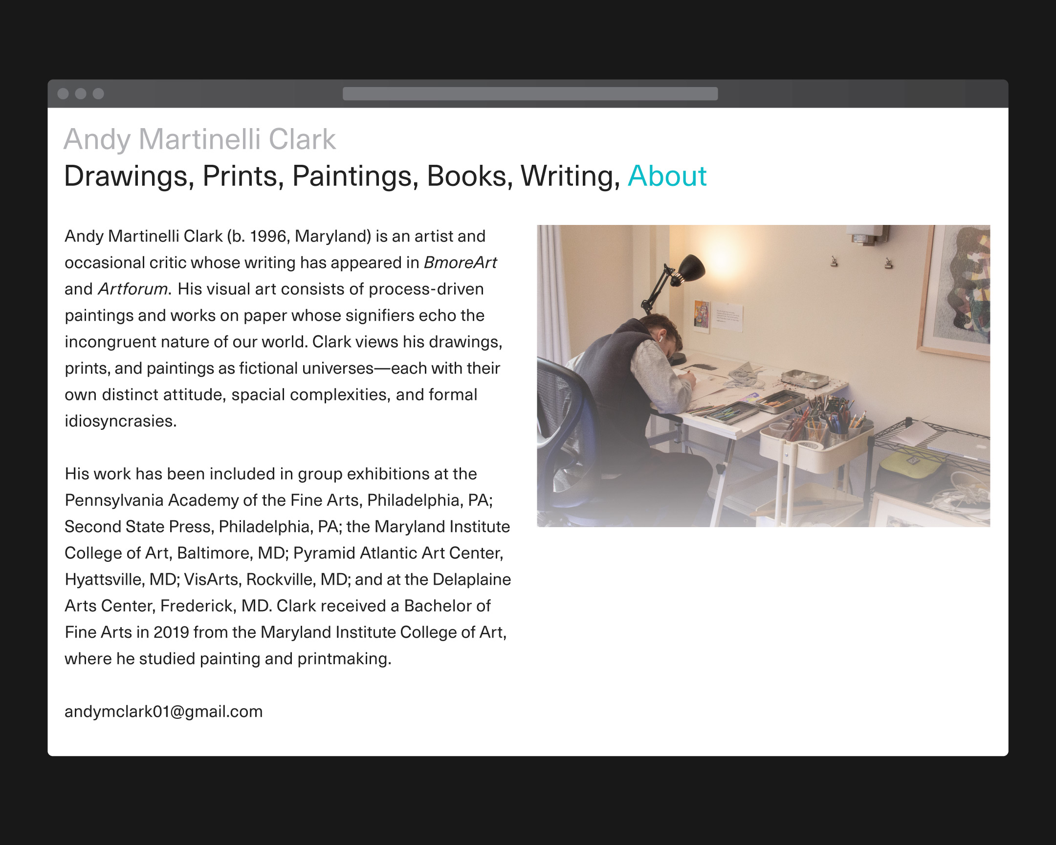
Artist Andy Clark asked me to design a new website as a digital space to present his work. In building the structure, we considered the design to be impartial— the layout needed to receed to the background and allow the art to come forward. The artist considers each drawing, painting, and print to be its own fictional universe and, like a website, has its own “distinct attitude, spacial complexities, and formal idiosyncrasies.”
Explore the live site ︎︎︎

A word on my own website
I consider my site to be the one real space on the internet carved out to capture who I am and what I care about. Unlike social media platforms, my site wants nothing out of you—I’m not harvesting data to force ads on you, I’m not looking to convert you to my own cult of ideology—I just want to show you my work.
The internet was founded as the culminating place for people to publish all of human knowledge and accomplishment, but it slowly devolved into an argumentative hellscape where truth is indistinguisable from lies. I envision a future in which we strive to restore the original intent of the internet by deviating from platforms that aim to convince and instead embrace websites that seek to present knowledge.
—
Since 2017, over 50% of web traffic (source ︎︎︎) has been from mobile devices like smartphones and tablets. The mobile view of a website can no longer be an afterthought: it has to be equally as important to the structural integrity of its build. With that in mind, I’ve opted for a slightly different image ratio than is usually seen elsewhere, for a consistent feel across each viewing platform.

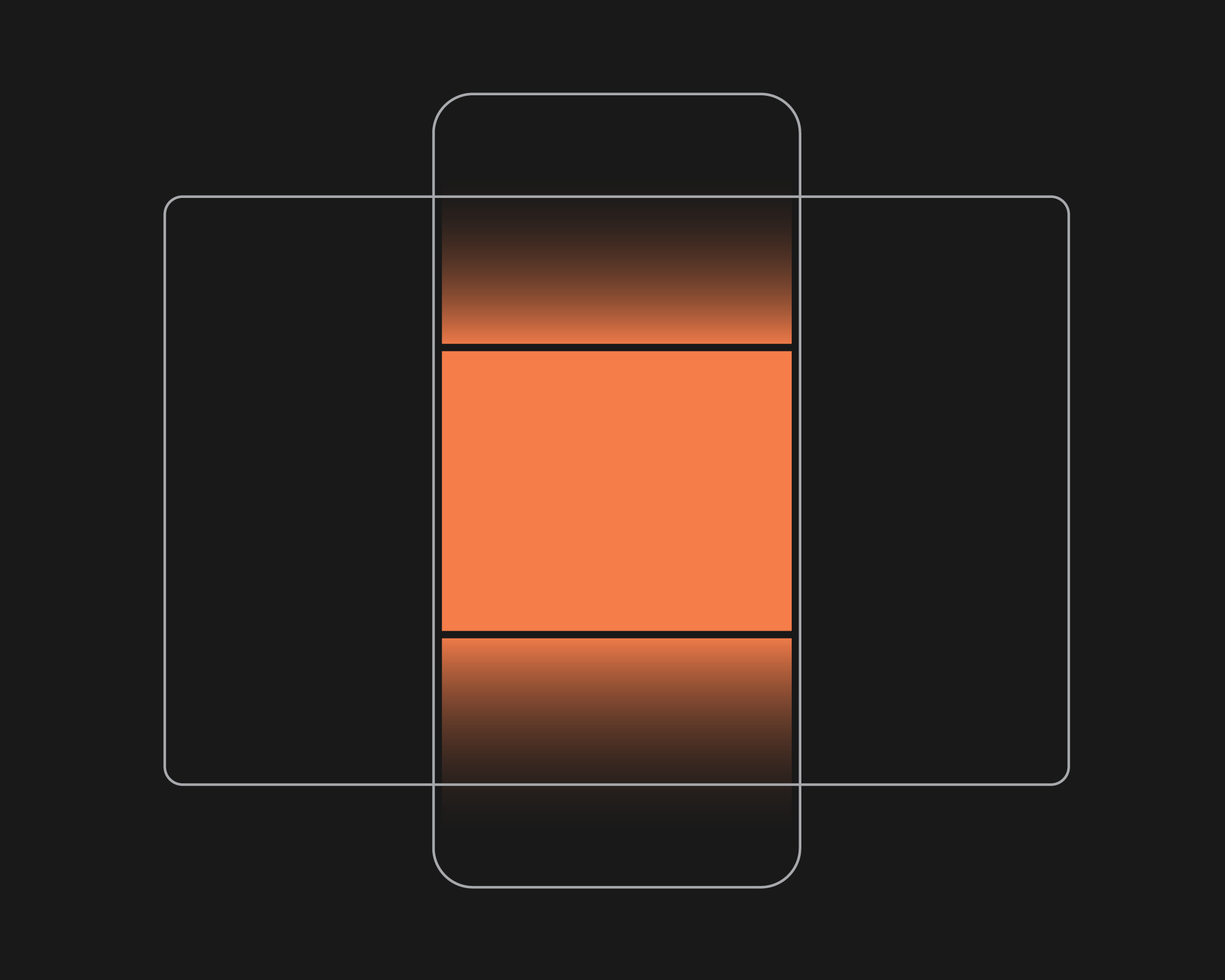
Additionally, I’ve designed the site around its black background to realize a better harmony between hardware and software. The overwhelming majority of devices used to access the internet have a black bezel surrounding the screen, so it only makes sense to present information on a black ‘extension’ of the bezel, rather than polarize the interface from the device that powers it by choosing a white or colorful background.
Thank you for visiting!